September 2014 BERRYSMITH was given to task to create their new logo and branding.
Their brief “We want a new logo to move us forward with growth!”
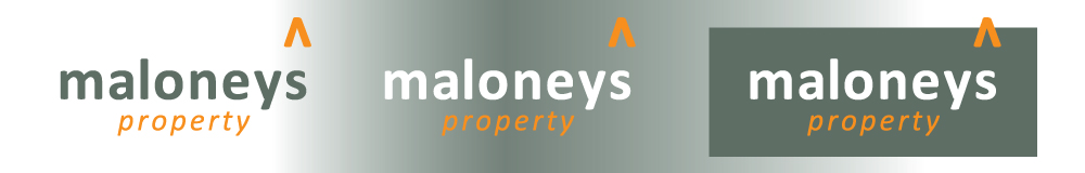
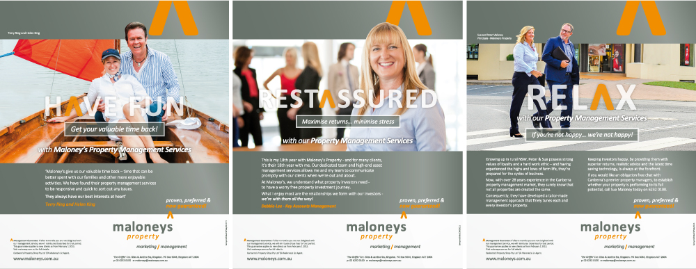
The outcome combines new colours, a new font and a positive icon – the arrow.
Maloney’s new font in lowercase and open kerning reflects approachability (Grey – neutral and conservative but does imply security and reliability).
The arrow (Orange – colour of adventure, which inspires and creates enthusiasm. It is optimistic and sociable and suggests affordability) elevated above the business name is an extension/interpretation of the apostrophe. It is a symbol of aspiration or rising up. It has become the symbol of the business branding.
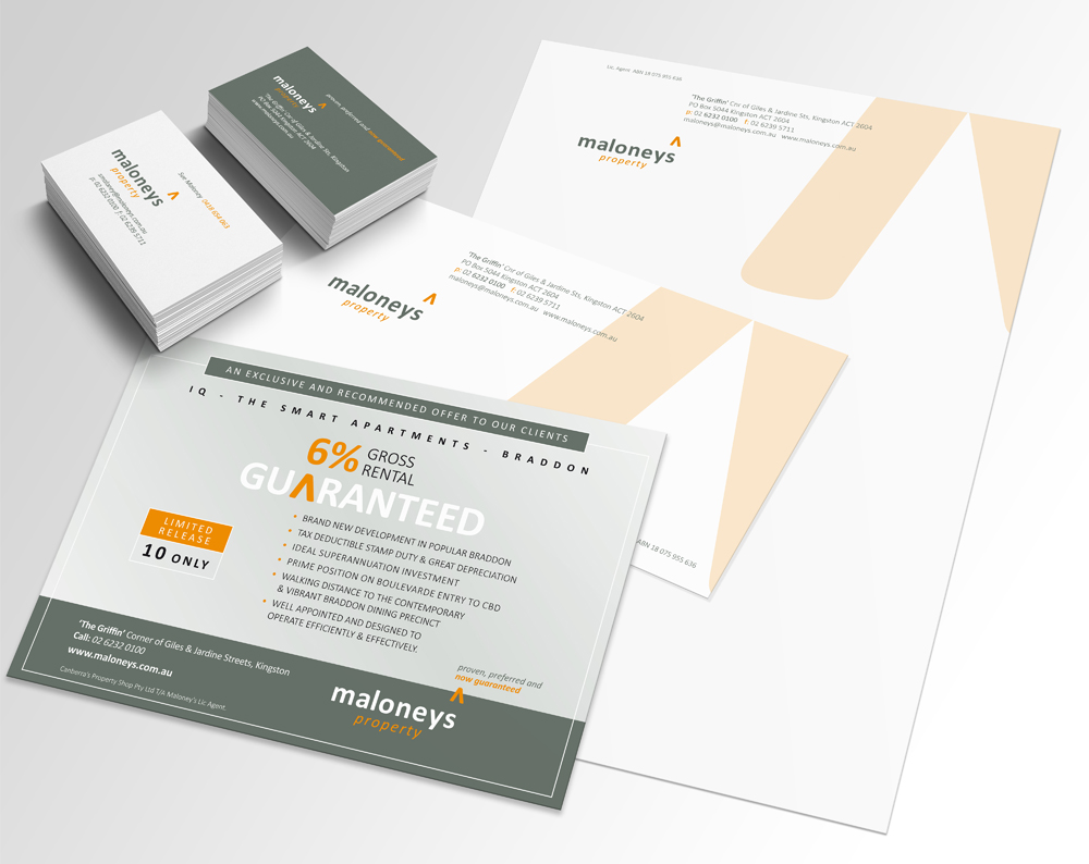
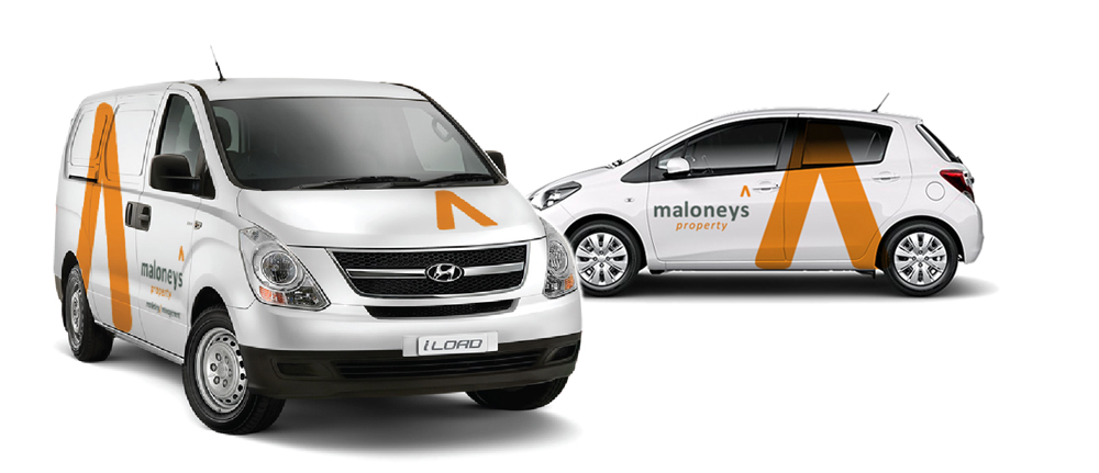
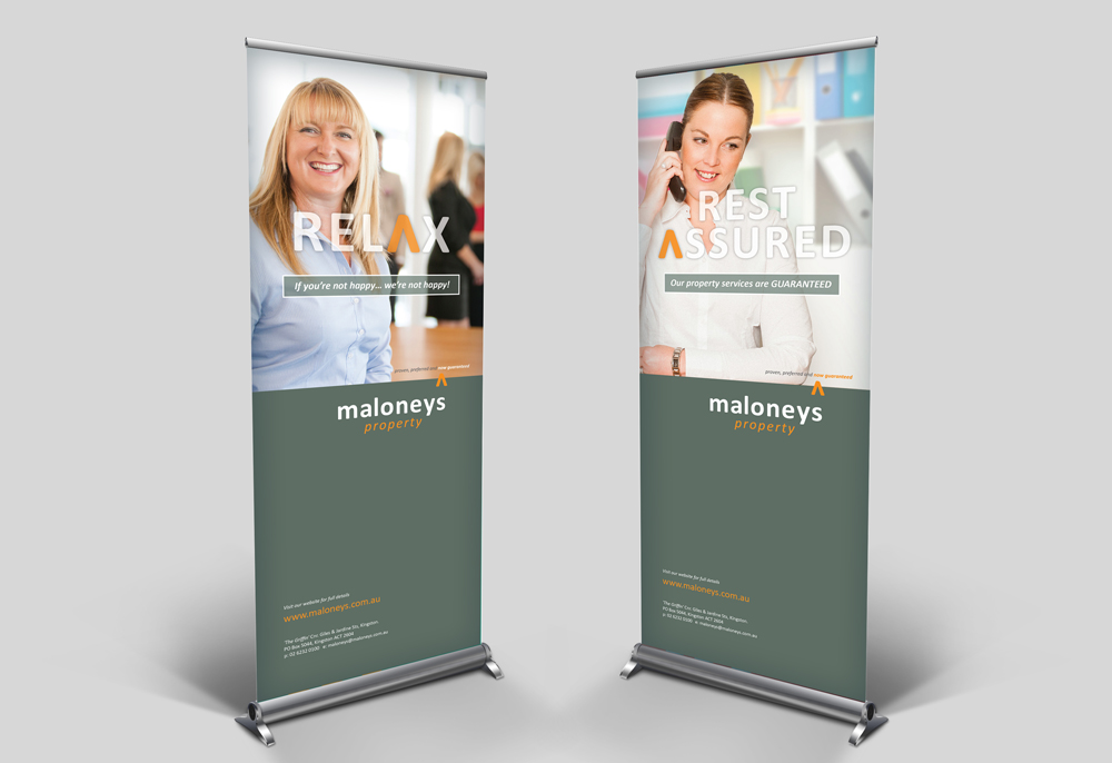
Applied to all internal and external printed material, website, directional signs, social media, vehicles and print advertising.